March’2025 - April’2025
Brand Identity
An infrastructure company focused on creating premium, future ready spaces, and smart infrastructure projects.
Initial brainstorming
Rohith had reached out wanting to build a basic yet a strong brand identity that speaks to his target audience. He wanted a brand that feels premium, minimal, and something that exudes strength, sophistication, and trust at first glance.
As we spoke more about it, we understood that Rohith wanted Aara to be this brand which makes people feel something, he wanted it to be more than a space. He wanted to build spaces that connect, and make people feel like they belong.
Typography
ZT talk - medium
a b c d e f g h i j k l m n o p q r s t u v w x y z
Logo suite
Primary logo:
For the logo, we wanted to find typefaces that are clean and minimal yet feel sophisticated. We also wanted it to stand out from the other companies in the industry, and strongly compete with our competitors who are ‘myscape’ and ‘sobha’.
The letter ‘a’ in the wordmark is customized to give an edgy feel and show that Aara is different.
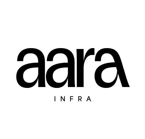
Aara wordmark
Logomark:
Rohith wanted the logomark to have a structural symbol, that gives a hint of it being an Infra company. So, we’ve tried to reimagine the letter ‘a’ in lines and angles, and managed to derive something that fit well with what they wanted.

Aara logomark how
Tagline
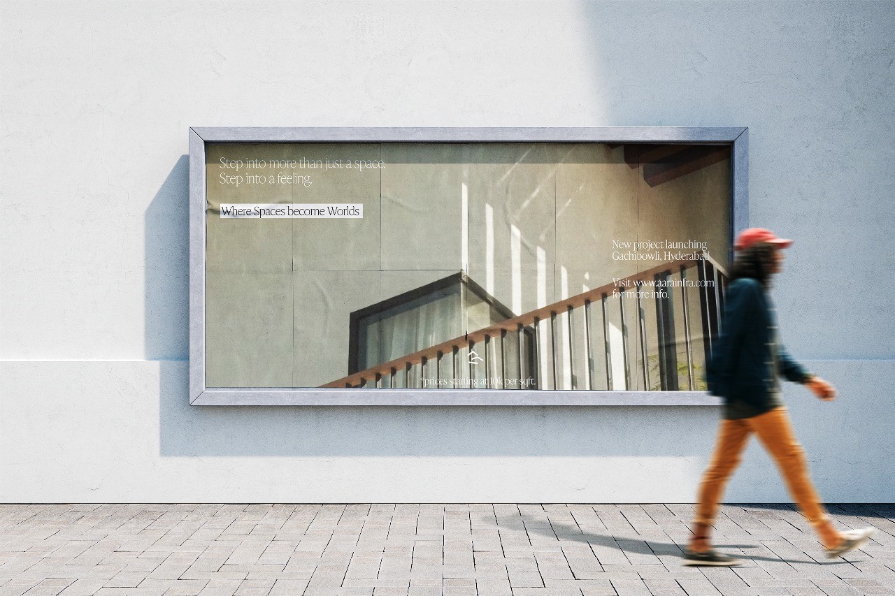
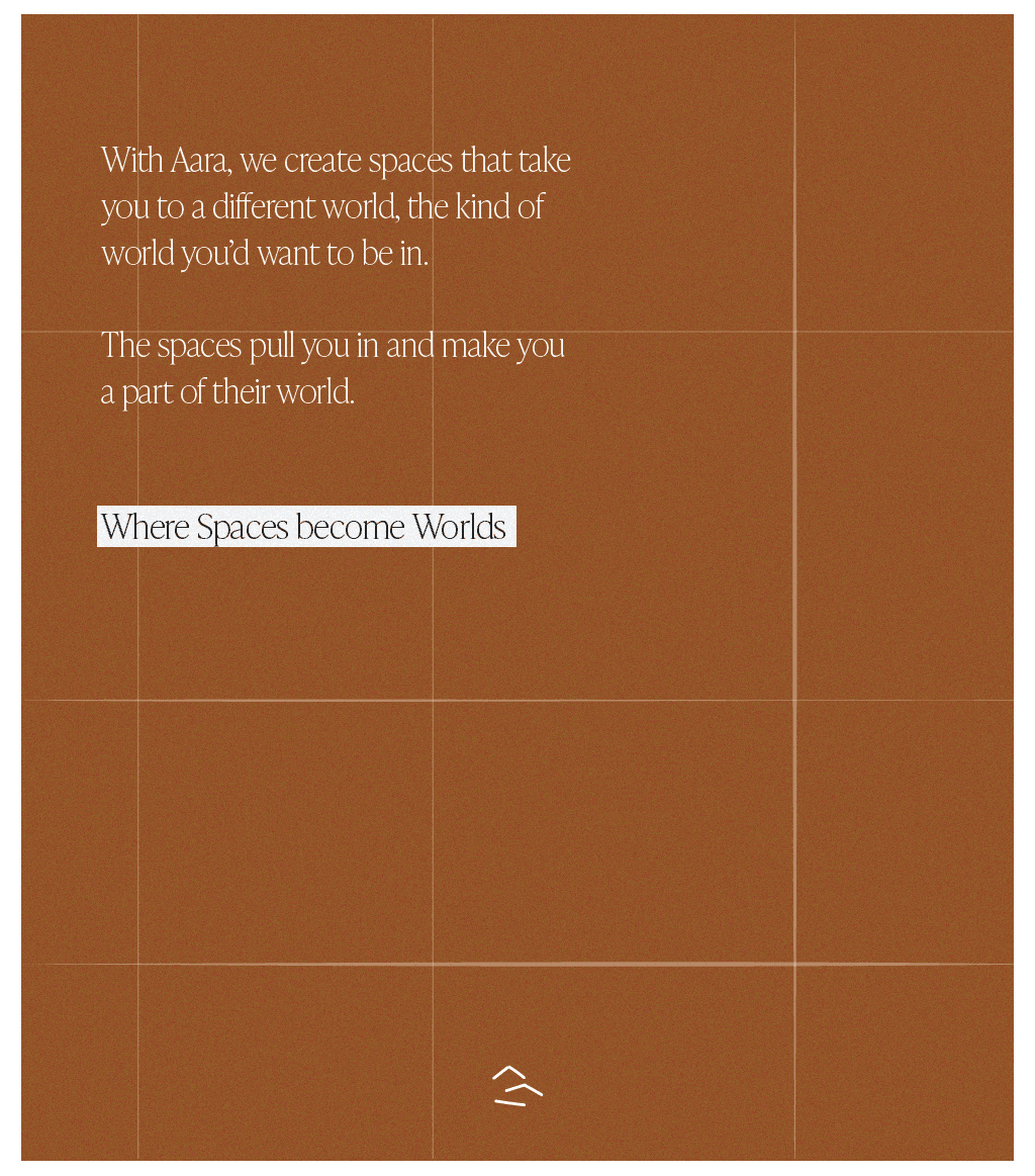
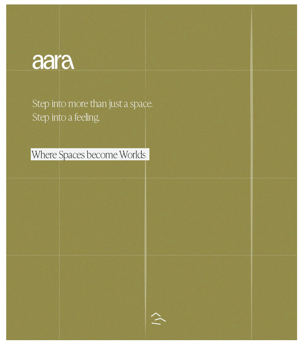
‘Where Spaces become Worlds’
‘Step into more than just a space. Step into a feeling.’
With Aara, we create spaces that take you to a different world, the kind of world you’d want to be in. The spaces pull you in and make you a part of their world.
Color
Palette
We wanted to find colors that help people associate or perceive the brand to be very warm, cozy and some place they wanted to be in.
Social media
templates
2025sudesignco